OBFF
Open Bible Faith Fellowship (OBFF) is a faith organization that hadn’t had a rebrand or website update in over 10 years. Their current demographic was aging, and they wanted to attract a new and younger audience. The new brand was clean, minimal but still has a distinct icon and look. This will allow OBFF to lean into their new look and updated visual language—so they can learn about what their organization responds to visually and is attracted to as they move forward.
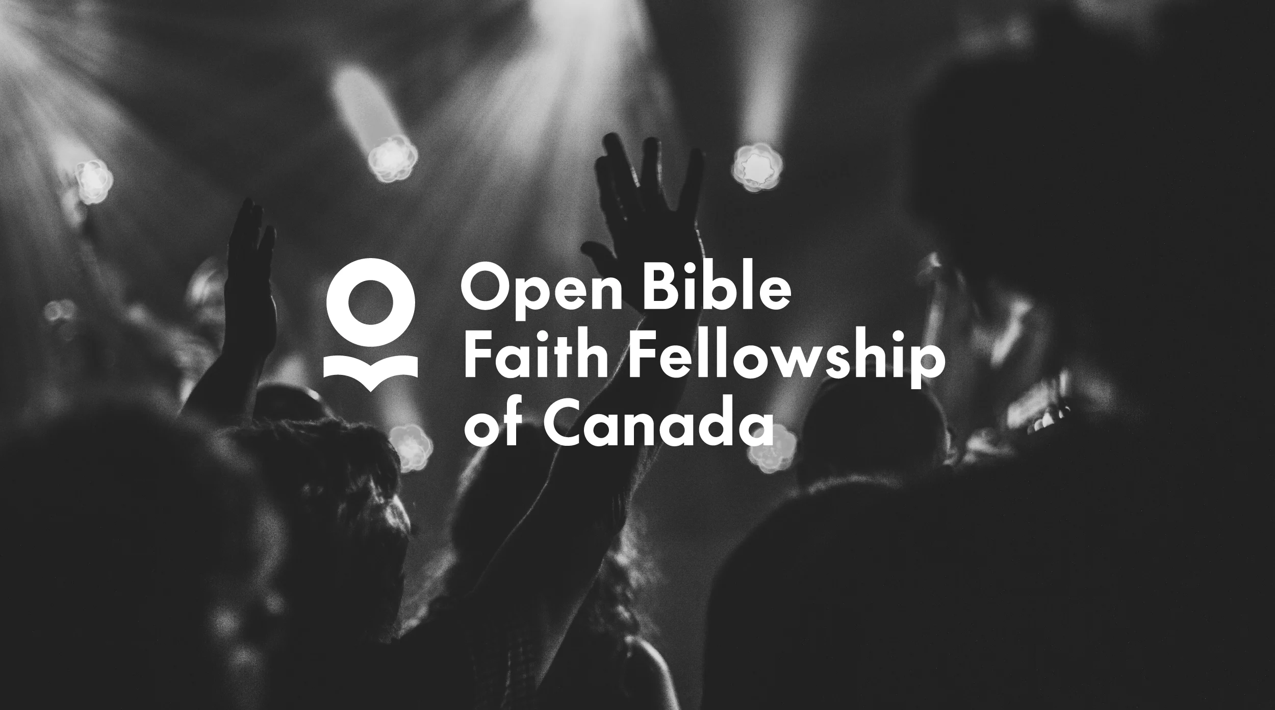
The icon speaks to an open bible—the circle coming out of the bible can be seen at as representing wholeness/eternity/faith. In short, the revelation that comes from the Word—revelation that comes in community—revelation that comes from teaching (the three key pillars of OBFF).
WOW! The new website is totally on point. Well done OBFF! – feedback from a board member after website launched
Icon, used on it’s own or with the full wordmark.