eryn shea photography
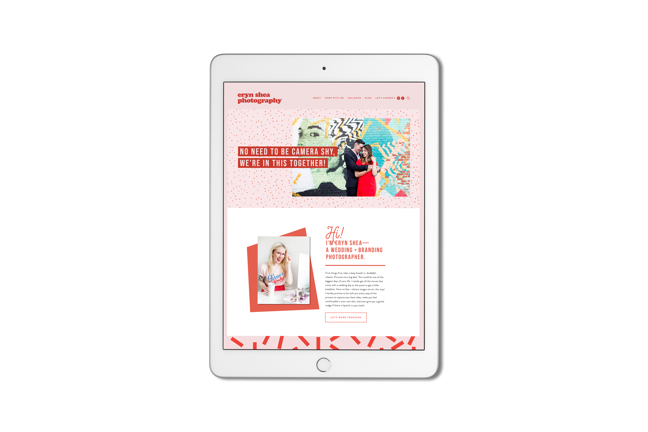
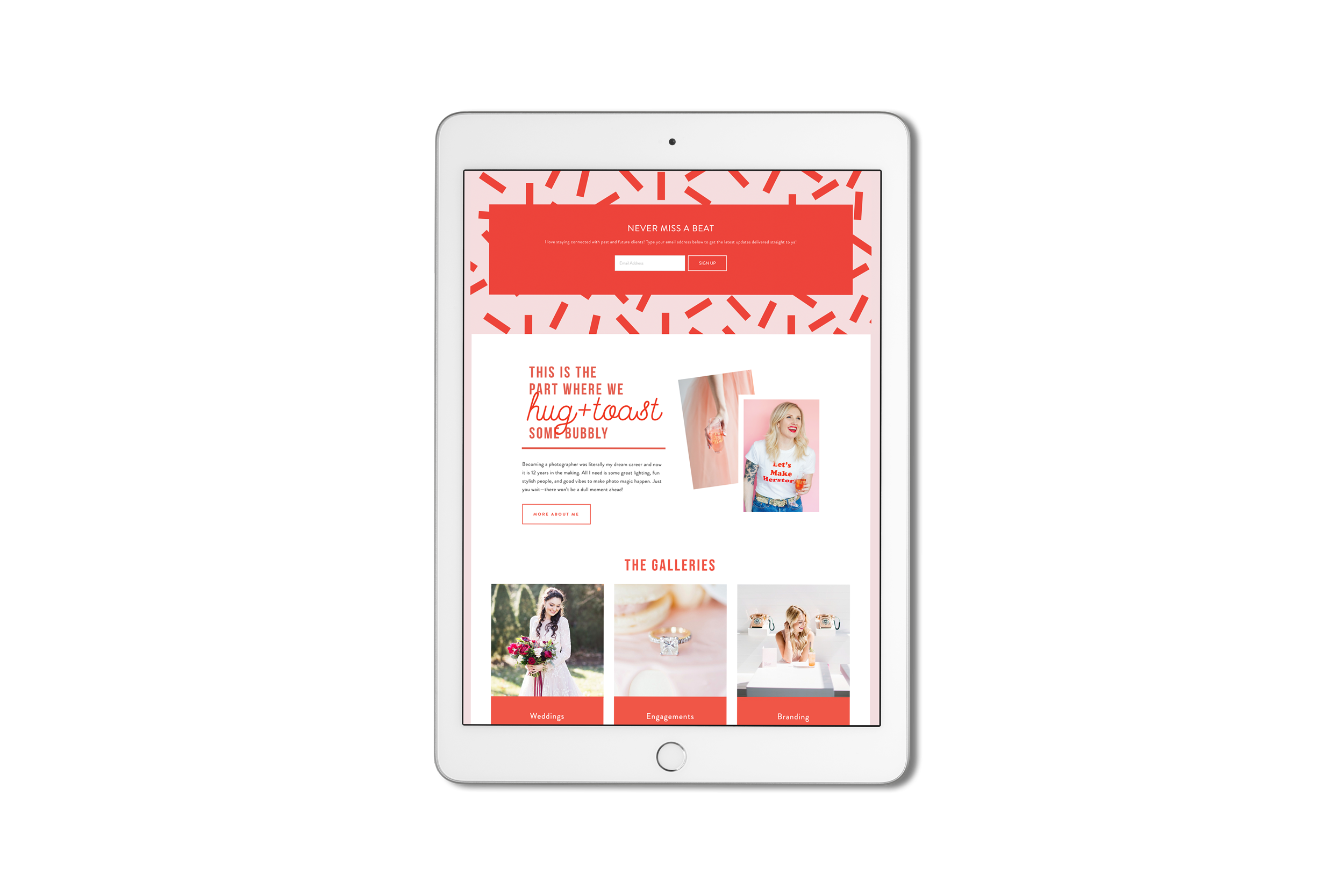
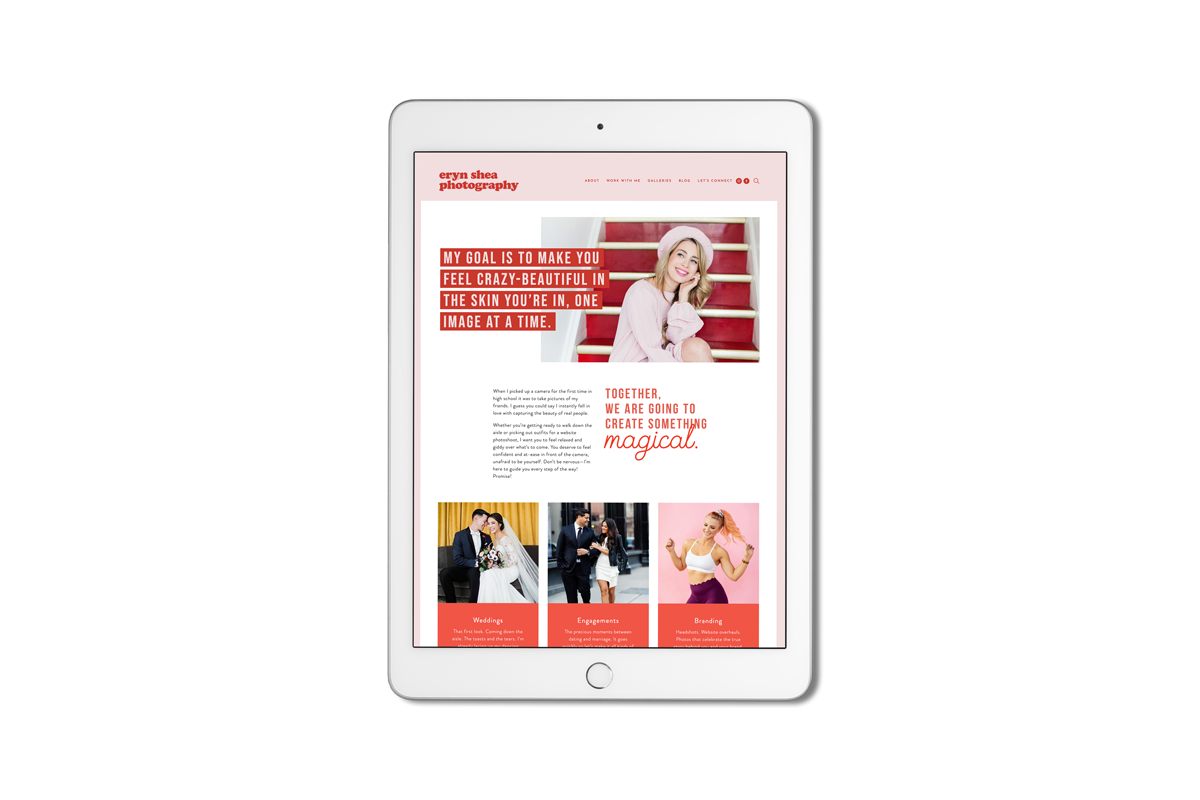
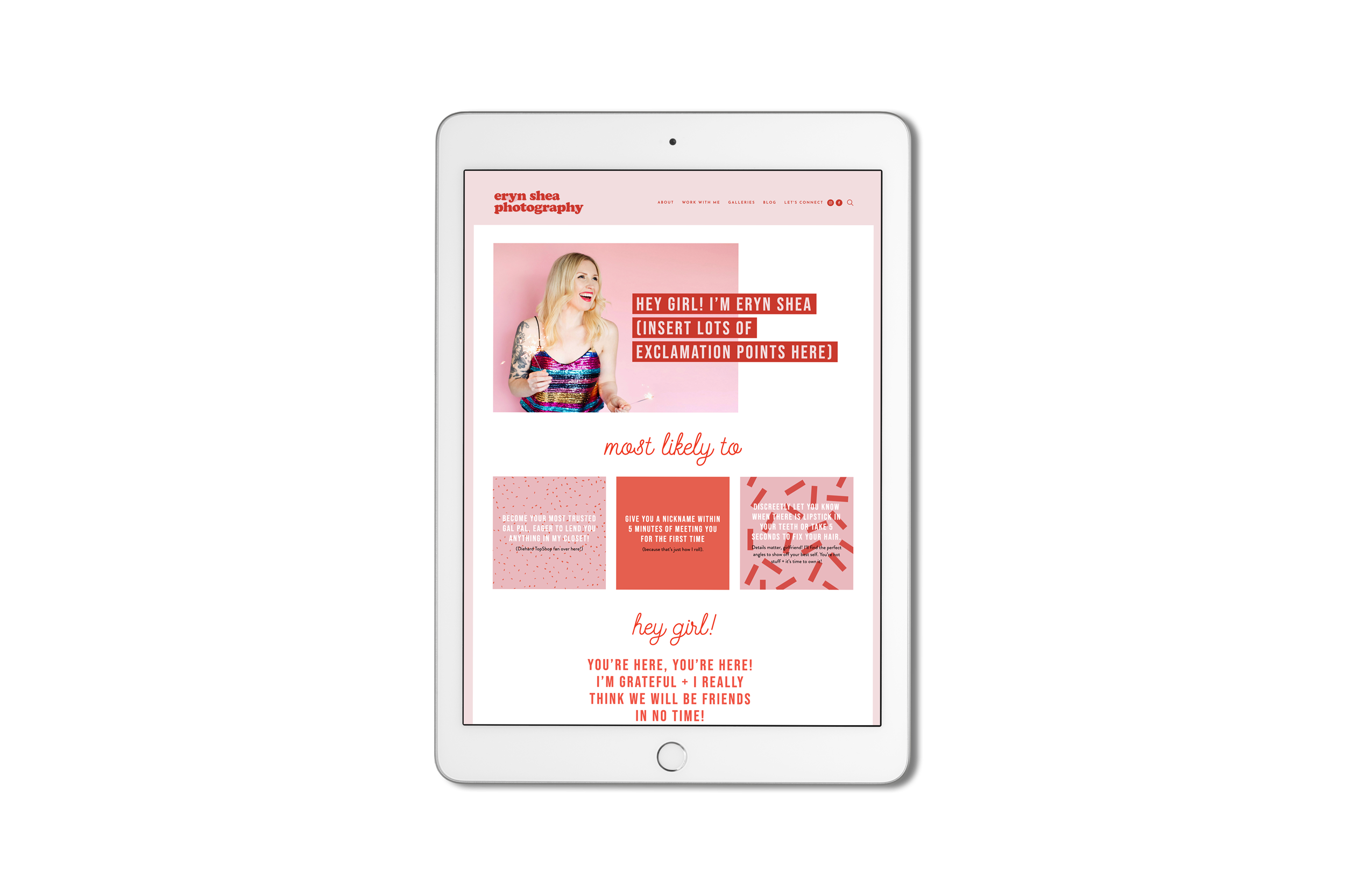
When Eryn reached out to begin the project, she knew that she wanted a fun new Squarespace site. She was not afraid of bold colors, 70s vibe and lots of patterns! The key was to pull her love of color and pattern into a site that wouldn’t overwhelm and would only strengthen her strong photography portfolio. Eryn’s final design is fun, bold, and vibrant to meet the vibe of her entire brand.
“The colours, the new logo, the graphics + the retro vibes, ahhhhhh it all makes me SO HAPPY! It was a labour of love that fits me in all the right places, like a fave pair of Levi’s.” – Eryn Shea, photographer
Project via GoLive
Moodboard for Eryn Shea Photography


